Prioritization is a top concern for most Product Managers. It’s by far one of the most popular topics on PM blogs, Q&A sites and other online communities.
Although it’s not what we are hired to do, it’s something that we have to do to achieve our real goal: creating successful products that bring value to our customers and to the business.
The need to prioritize comes from a very simple fact: we just don’t have enough resources to work on everything we can come up with.
Thus, we need a process to determine the sets (and sequence) of things that should be done on the product to deliver the most value at each point in time, given our constraints.
If we break this statement down, a core group of questions then need to be answered:
- How can we know what’s valuable? How valuable is it? Valuable to whom?
- How can we define the set of things that should go together in a product release? How should we sequence those releases?
- How can we get the necessary buy-in to follow through and get these things to the market?
- How can we know if our assumptions are right? Are we on the right track? Are we really delivering value? Could we do any better?
What this guide is all about
If you search around, you’ll find countless articles with recommendations, techniques and approaches to this very hard problem. However, each method’s usefulness will depend on the specific product or project where it’s applied. Your prioritization needs may vary vastly.
Here’s what you will get from this guide covering 20 popular product prioritization techniques:
- A map, in the form of a Periodic Table to help you make sense of what each technique has to offer;
- An overview of each method, with graphics and links to more in-depth resources;
- 5 commonalities and takeaways from all these methods.
You can read the post here or click here to download it as a PDF (along with a cheatsheet).
The Periodic Table of Product Prioritization Techniques
When I started working on this guide, I immediately felt the need to visually organize all of these techniques in a way that made sense and showed the context in which each of them is valuable.
With this mind, I found two dimensions that fulfilled these requirements and the result was the sort of Periodic Table you see below.[1]
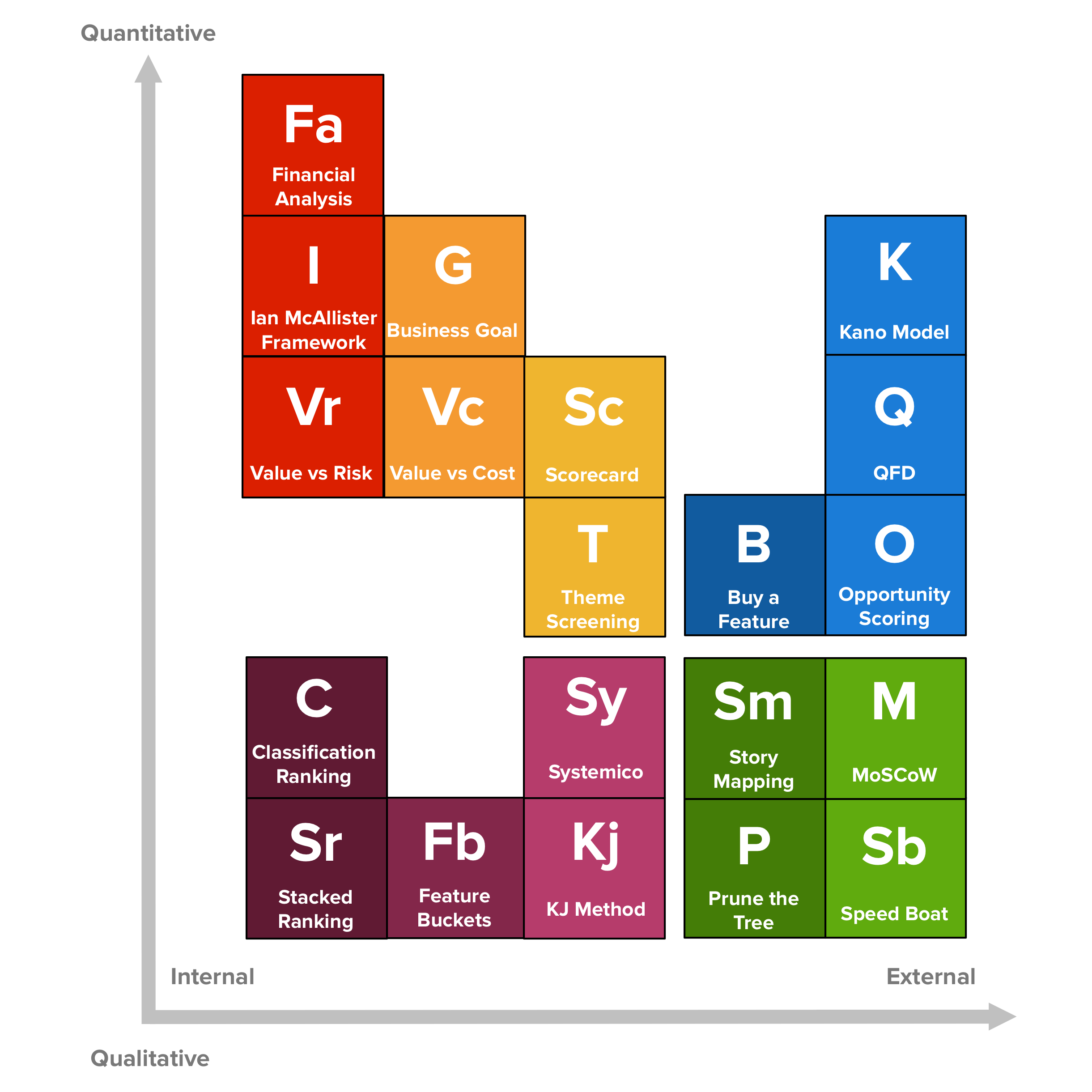
The horizontal axis tracks how oriented a method is towards getting input from the inside or the outside world. In other words, how much it depends on data and opinions from people external to the core product development team.
This dimension reflects the fact that sometimes you need involvement from the outside (e.g. end customers or stakeholders within the company) to help you prioritize. However, in other cases you might want to follow a simpler process with the development team or by yourself.
The vertical axis shows how quantitative is the method prescribed by each technique. That is, how much of it is based on expert (personal) opinions instead of some kind of metric, classification, voting or ranking.
Some people feel more comfortable around quantitative approaches and being supported by numbers (either for themselves or for people “higher-up”.) In other instances, you need to work on the qualitative side if what you’re trying to achieve is not quantifiable or if it doesn’t make sense in your context.
Every technique was placed in the table taking into consideration what I believe to be their relative positions along these two dimensions. Individual locations might be debatable, but I think this is a good starting point to navigate them[2].
The next section presents an overview of each technique, including pointers to other relevant and in-depth resources.
An Overview of Product Prioritization Techniques
External & Quantitative Techniques
The Kano Model
Noriaki Kano, a Japanese researcher and consultant, published a paper in 1984[3] with a set of ideas and techniques that help us determine our customers’ (and prospects’) satisfaction with product features. These ideas are commonly called the Kano Model and are based upon the following premises:
- Customers’ Satisfaction with our product’s features depends on the level of Functionality that is provided (how much or how well they’re implemented);
- Features can be classified into four categories;
- You can determine how customers feel about a feature through a questionnaire.
Satisfaction vs. Functionality
Kano proposes two dimensions to represent how customers feel about our products:
- one that goes from total satisfaction (also called Delight and Excitement) to total dissatisfaction (or Frustration);
- and another called Investment, Sophistication or Implementation, which represents how much of a given feature the customer gets, how well we’ve implemented it, or how much we’ve invested in its development.
The Four Categories of Features
Features can fall into four categories, depending on how customers react to the provided level of Functionality.
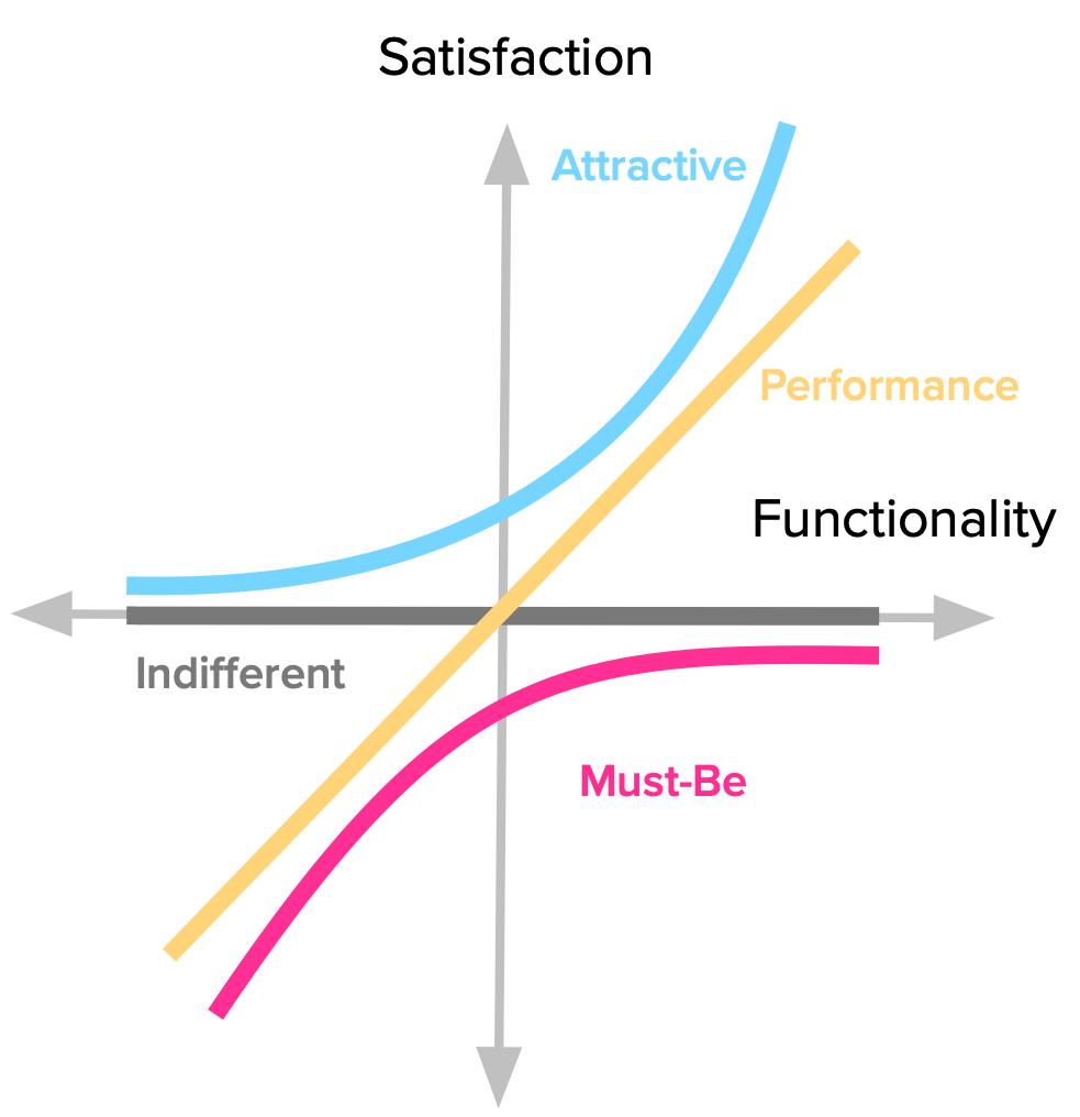
- Performance Some product features behave as what we might intuitively think that Satisfaction works: the more we provide, the more satisfied our customers become.
- Must-be Other product features are simply expected by customers. If the product doesn’t have them, it will be considered to be incomplete or just plain bad. This type of features is usually called Must-be or Basic Expectations.
- Attractive There are unexpected features which, when presented, cause a positive reaction. These are usually called Attractive, Exciters or Delighters.
- Indifferent Naturally, there are also features towards which we feel indifferent. Those which their presence (or absence) doesn’t make a real difference in our reaction towards the product.
Determining how customers feel through a questionnaire
In order to uncover our customer’s perceptions towards the product’s attributes, we need to use the Kano questionnaire. It consists of a pair of questions for each feature we want to evaluate:
- One asks our customers how they feel if they have the feature;
- The other asks how they feel if they did not have the feature.
The first and second questions are respectively called the functional and dysfunctional forms. To each “how do you feel if you had / did not have this feature”, the possible answers are:
- I like it
- I expect it
- I am neutral
- I can tolerate it
- I dislike it
For each answer-pair, we use this table to determine the category where the respondents falls, letting us know how they feel about the feature.
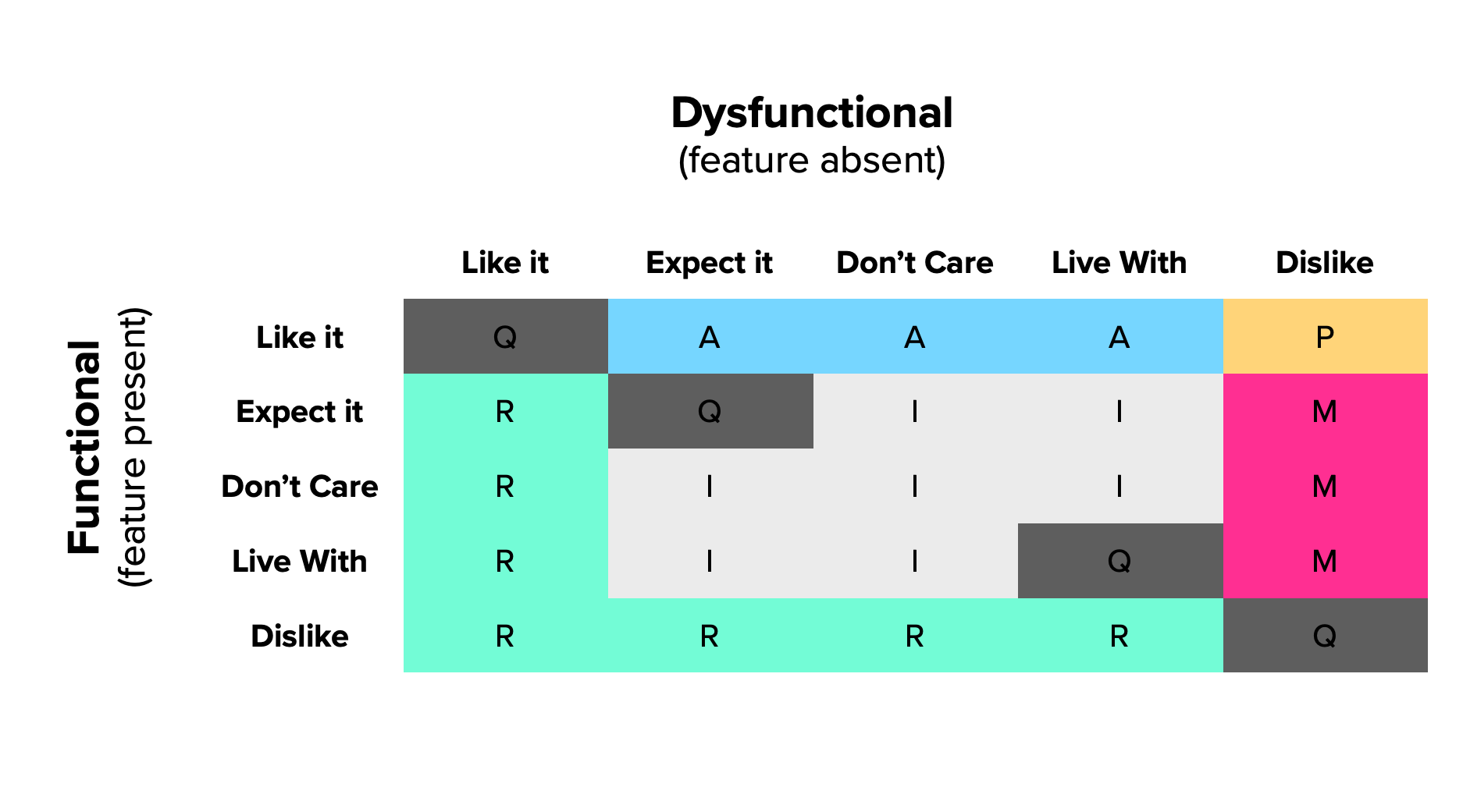
From the individual responses and resulting categories you can go into two levels of analysis:
- Discrete: each answer-pair is classified using the table above and feature’s category will be the most frequent across all respondents;
- Continuous: each functional and dysfunctional answer gets a numerical score, which can then be averaged over all respondents and plotted on a 2D graph.
As a general rule of thumb, features should be prioritized such that this order is followed: Must-Be > Performance > Attractive > Indifferent.
There are a lot more details that are worth exploring about this method. I wrote an extensive, in-depth guide to the Kano model that explains the entire process and gives you a step-by-step guide on how to use it.
Quality Function Deployment
Quality Function Deployment (QFD) is another method originating in Japan and originally described by Yoji Akao in 1966 for the manufacturing industry. When reading on this subject, there’s a lot of very dry content, but it has an interesting application in our field.
The most valuable thing that QFD brings to the table is a way to help us focus on product features viewed from different angles, in particular, the customer and the company. There are many dimensions of analysis and this method yields a decision matrix shaped like a house, which is why it’s also called “house of quality.”
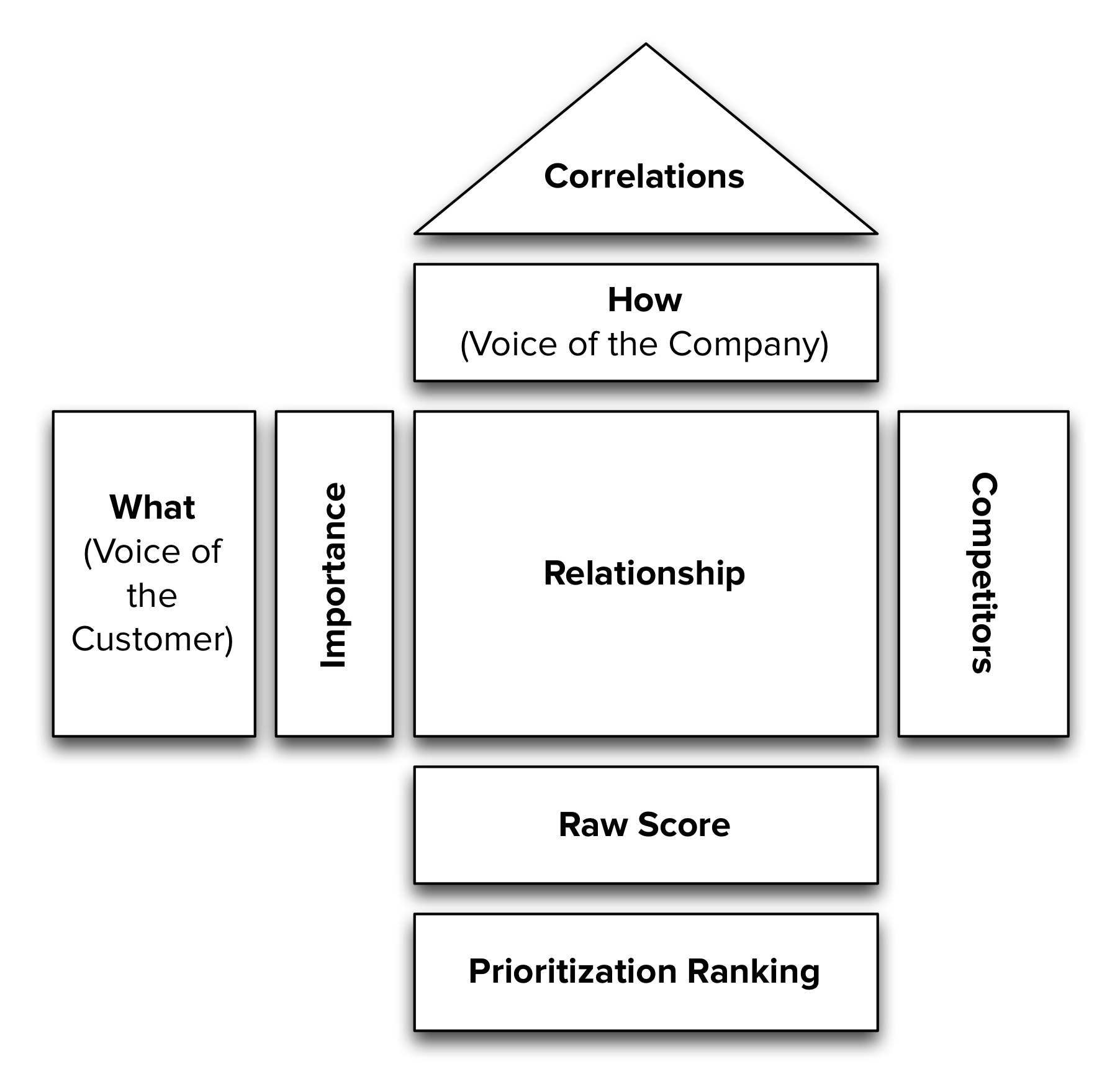
This great article by Jeff Sauro describes how to use QFD for digital products. Here’s the gist of the process:
- Identify customers’ wants and needs Produce a list of things that are potentially valuable to your users and customers. Do some internal brainstorming, interview current and past customers, survey the competition and any other way to get new task and requirement ideas that you come up with. These are called the “What’s”.
- Identify the “Voice of the Customer” It’s now time to know what’s more important to the customers, out of all the other options. Be mindful that simply asking people to tell you what they consider to be most important, usually yields some kind of “everything” response. To avoid this, you can ask them to select the top 5 out of a larger pool of options. Use the percentage of respondents that picked each task as the importance weight factor for the Voice of the Customer.
- Identify the How’s (The Voice of the Company) Create a list of concrete features, fixes and enhancements that relate to the tasks that customers want. Items may come the product backlog or may be new ideas resulting from the customers’ feedback. These are called the “How’s”.
- Relationship between “Voice of the Customer” and “Voice of the Company”
Establish an impact relationship between what customers Want and How the company proposes to fix it. That relationship should be scored in a non-linear scale, so differences in impact are more accentuated. These are common values that should be defined for each Want + How combination:
- 9 → Direct and Strong relationship
- 3 → Moderate relationship
- 1 → Weak/indirect relationship
- Blank → No relationship
- Generate Priorities Priorities come from the highest-impact Features, across all customer requirements. This is obtained by multiplying each requirement’s importance by each feature’s impact. A feature’s score is the sum of these values. The highest priority items will be those with the highest scores.
- Examine Priorities Using this method, there should be enough differences among features to determine which are most important. It will also show if any customer want is not being solved by a how; this is perfectly fine, as long as the want is not an important one.

This is how a QFD matrix looks like, following Sauro’s method. I recommend reading the original article and grabbing the handy spreadsheet, to help tabulate everything.
Opportunity Scoring
This technique comes from Anthony Ulwick’s Outcome-driven Innovation (ODI) framework.
The framework builds on the core precept that people buy products and services to get some job done. That is, it’s the expected outcome that matters. Clayton Christensen’s jobs-to-be-done concept shares this line of thinking and it’s been a hot a topic that has gathered a lot of attention lately[4].
One of the main conclusions from this is that customers are not very good sources of solutions, because they aren’t subject matter experts. However, their input is extremely valuable in understanding the outcomes they want from the product.
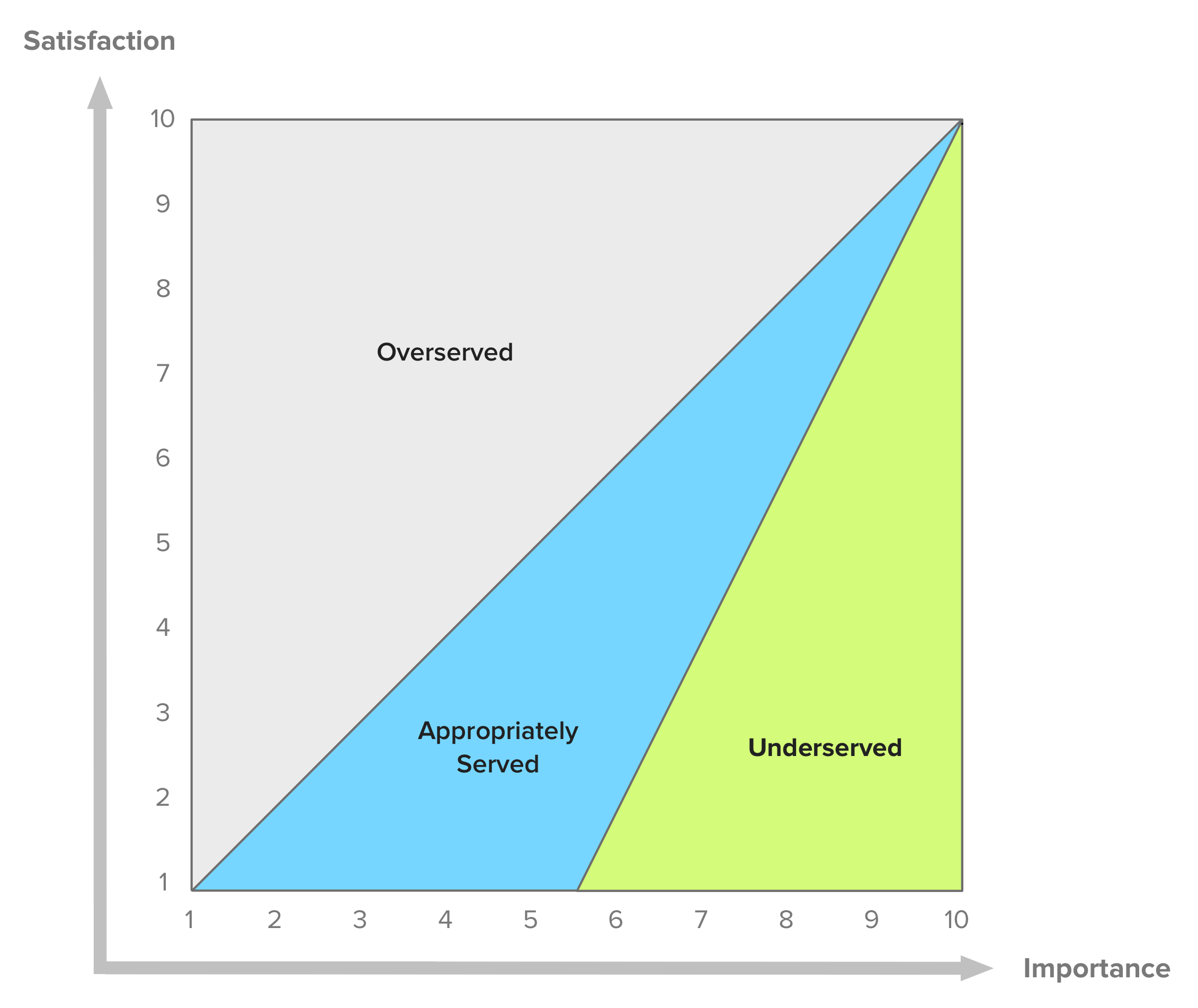
Through User Research and other methods, we can build a list of desired outcomes for the product. Then, we need to ask customers to score each outcome on how important it is for them and the degree to which it is satisfied on a scale of 1 to 10. Given these, Ulwick proposes an Opportunity Score that is given by this formula:

What comes out from this are the most interesting opportunities for innovation, in particular areas with high importance and low satisfaction. It may also be used to identify areas where costs can be reduced (i.e., customers are highly satisfied but don’t rank them as important, which could mean wasted resources.)
These results may be plotted on a graph, providing a visual aid to better understand where opportunities reside.
Buy a Feature
Buy a Feature is a fun innovation game that can be played collaboratively or individually. Here’s how it works:
- A set of features that need to be prioritized are presented to a group of buyers (our customers);
- Each buyer gets a budget of play money to spend on features;
- Each feature is priced according to some measure of cost (complexity, effort, actual cost to develop, etc.) — as long as it’s the same criteria for all features, you can use any one you prefer;
- Each player’s budget should be between a third to half of the total cost for all features;
- It’s possible to play the game in one of two ways:
- Individually — Players are told to use their budget to buy the features that are most important to them;
- Collaboratively — Using a pricing scale that makes some features too expensive for individual buyers to purchase. This forces collaboration and negotiation between players to buy features that are valued by multiple players.
- As players buy features, collect the money and ask them to explain why they’re buying it;
- The game ends when the money runs out or when players have bought all the features they’re interested in (explain to them beforehand that it’s OK for money to be left over.)
This will yield a valuable set of insights on the most important features for customers, as we can analyze which features got bought the most, the reasons for their purchase and which collaborative bids were made on expensive items.
To get more data, multiple instances of the game can be played (in groups of 8 people at most.) Also, for large feature-sets, you can set up a championship where popular features are bubbled up through multiple phases of games.
Buy a Feature is best played in person due to its collaborative character, but there are online solutions if that’s what you need.
Check out this article for a more detailed game explanation and templates for feature cards and play money notes.
A side-note for Project Managers
This method is also very useful for internal or consulting projects that are not exposed to the market, by involving stakeholders as the buyers in the game. It’s a great way to build strategy for the project, consensus on what’s most important, and communicate to stakeholders the notion that features have different development costs[5].
External & Qualitative techniques
Story Mapping
Story Maps were first introduced by Jeff Patton in this 2005 article and followed-up by another one writing up his more recent experience. Both are excellent reads that I can’t recommend highly enough.
The main idea behind Story Maps is that single-list product backlogs are a terrible way to organize and prioritize the work that needs to be done. A richer structure is necessary.
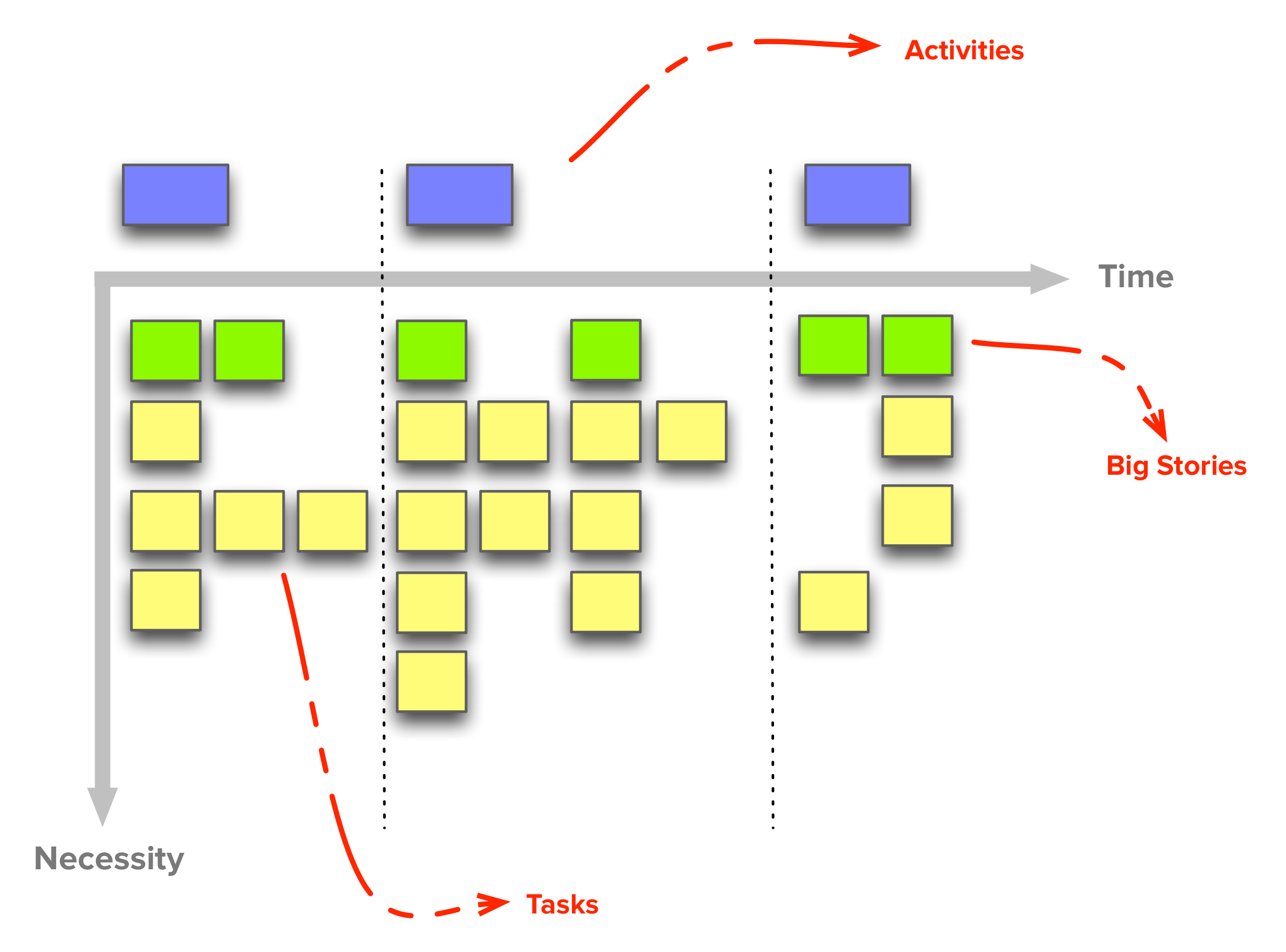
In very broad strokes, a Story Map is organized like this:
- There’s a horizontal axis that represents usage sequence;
- User stories (or “tasks”) are placed along this axis, in the sequence in which they are performed by the user;
- The vertical axis stands for criticality;
- User stories (or “tasks”) are arranged vertically as to how important they are (from top to bottom);
- Equally important stories can be kept at the same height, but keep in mind that, in general, it’s important to differentiate stories’ relative importance to be able to create better release plans.
- Groups of related user stories can be grouped as Activities:
- Create a vertical line to separate groups of stories from others;
- For example, an activity may be “managing email”, with “send an email to one or more addresses” being a user task;
- Activities sit above the vertical axis and don’t have any usage sequence, they “just are” — these activities compose the major attributes for the product and can’t be prioritized (think “you can’t prioritize a car’s motor over its wheels”)
There are many advantages to this kind of backlog organization, but the most relevant to prioritization and execution are these:
- It’s a visual tool that lets customers, stakeholders and development team members share a common understanding of what the system does;
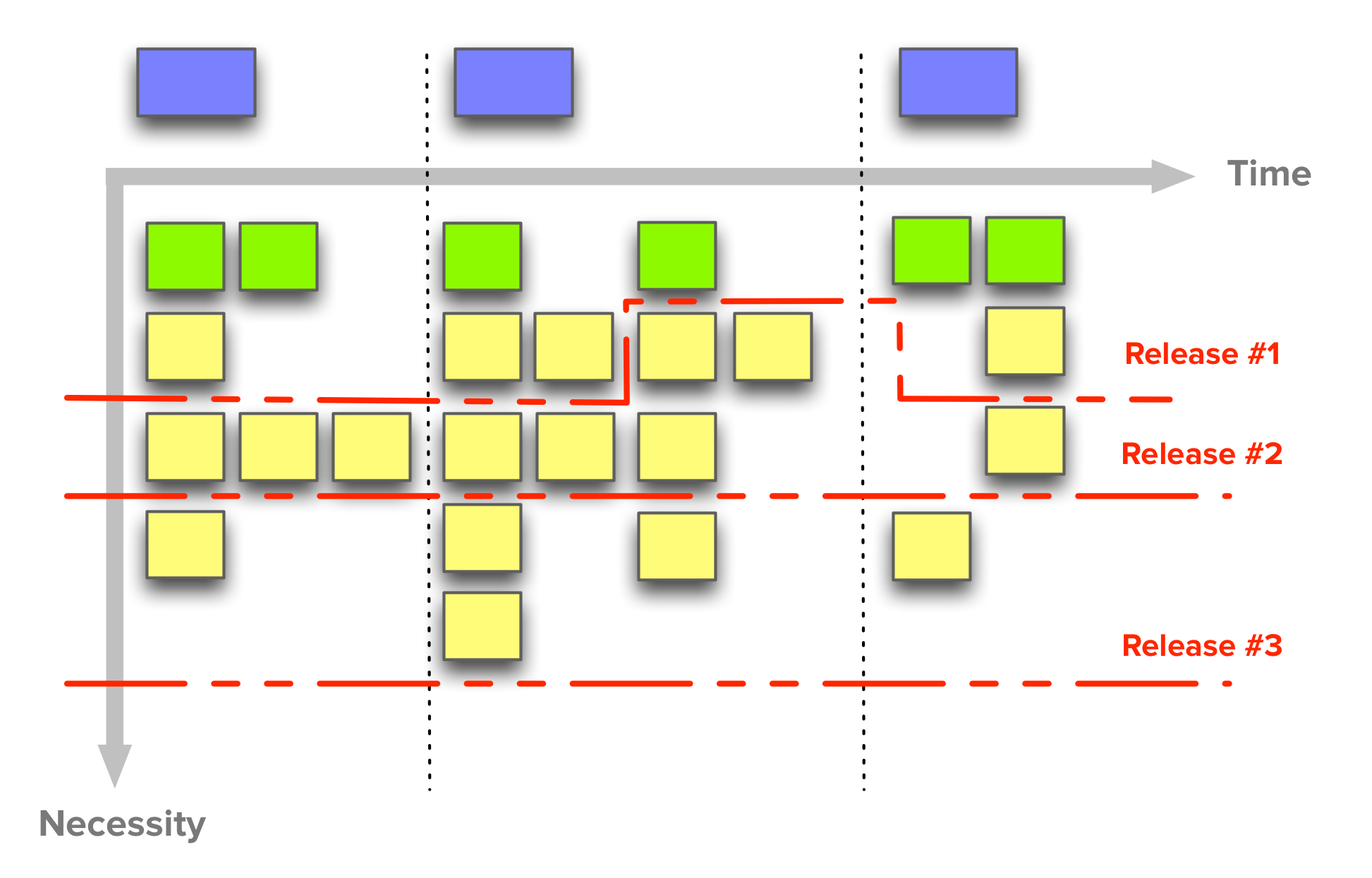
- It very clearly defines how to incrementally release product iterations that deliver complete working releases with increasing sophistication — this is Alistair Cockburn’s concept of the walking skeleton.
- To define releases, create horizontal lines along the map, selecting stories with equivalent criticality levels;
- This leads to complete end-to-end versions of the product and consequently to faster delivery and market validation (crucial at the MVP stage.)
In my personal opinion, the main drawback for this structure (and the necessary time investment to create and groom it) is that it’s too heavy for projects or products in highly dynamic contexts. That is, when visibility into the future shape of the product is not great (e.g. sub 3 to 6 months), I prefer a different (but related) approach.
MoSCoW
The MoSCoW method is a prioritization technique used in multiple management fields to reach a consensus on what’s more important to stakeholders and customers.
The term is an acronym with each letter standing for one of the possible prioritization categories (with Os added to make it memorable.) Requirements are thus classified as:
- Must have — these are critical and must be included into the product. If even one isn’t included, the release is considered a failure. These can be downgraded if there’s agreement among stakeholders.
- Should have — these requirements are important but not crucial for the release. They’re the first level of “Nice to have”, and generally share the importance of MUST requirements, without being so time-sensitive.
- Could have — these requirements are desirable but not necessary for the release. They’re usually low-cost enhancements to the product. Due to their lower importance, they’re the second level of “Nice to have” features.
- Won’t have — these are considered to be the least-critical or even not aligned with the product strategy. They are to be definitely dropped or to be reconsidered for future releases.
This method offers a quick and simple prioritization solution. The problem comes with its lack of grading within categories. For instance, how can we know which SHOULD or COULD requirements are more important than others? Because of this limitation, the MoSCoW method is probably better suited for internal projects instead of products with many customers — talking to a handful of stakeholders about prioritization subtleties will always be easier than a larger scale contact with end customers.
Prune the Product Tree
Another innovation game from Luke Hohmann. Prune the Product Tree is about shaping the product’s direction towards market needs, but also understanding if some product areas are being left behind.
The analogy in the game is that the product is a tree that will be pruned to our liking. Although gardeners do this by cutting parts of the tree, the goal is to shape — it’s not about the cutting.
Here’s how it works:
- Draw a large tree on a whiteboard or sheet of paper;
- Thick limbs represent core product areas and its outermost branches represent currently available features;
- Write potential new features on some Post-It notes;
- Ask customers and stakeholders to place their desired features on the tree, thus defining its next phase of growth.
From here you may extract valuable data points. Is the tree growing in a balanced way? Are specific areas growing disproportionately larger? Are previously under-developed areas growing now?
Having a shared view of the entire span of the product with customers can be very insightful when planning new releases. From this visual balance you derive relative value among features, understand which strategic shifts might need to be done and which areas of the product are good candidates for being dropped in the future.
Speed Boat
One final innovation game in this overview. I find this one particularly interesting because it focuses on a different kind of prioritization: identifying which are the least liked features in the product.
If you ask people to tell you about their grievances on the product, you may be in for a dose of frustration. Creating a “let it all out” kind of session with customers can generate a large amount of feedback with a lot of noise.
If you instead ask the same thing with a controlled and positive turn, you will be able to get to the truly important customer complaints. And that’s the premise for this game. It goes like this:
- Draw a boat on a whiteboard or large piece of paper;
- This is a speed boat, and it should go really, really fast;
- Unfortunately, it’s being held back by some anchors;
- The boat is the product and anchors are the features that customers feel frustrated with;
- Ask customers to write on Post-it notes the features they’re not happy with and how much faster they estimate the boat could move without those anchors;
- Each anchor and speed estimate will give you a measure of “pain” which you can later prioritize for improvement.
Hohmann’s insight is that although customers may have complaints, they’re almost never all-out against the product. Most of the time they want to succeed using it, despite their frustration. That’s why creating this gamified outlet is more effective — it sidesteps the groupthink that may arise in a “share your complaints” session, and frees people to express their opinion with less bias.
Internal & Quantitative Techniques
Financial analysis
Product initiatives and projects are often undertaken with a specific goal of increasing revenues or reducing costs. Also, many organizations require a business case for new product features. For these and similar situations, it’s necessary to do a financial analysis of candidate development themes[6]. Those with the best financial outcomes are then prioritized.
We’ll explore common metrics for evaluating financial returns, but I suggest reading more on the subject if you’re interested in this kind of analysis and prioritization, as it gets complex pretty rapidly. Mike Cohn’s excellent book, Agile Estimating and Planning, dedicates an entire chapter to this topic.
There are 4 kinds of financial goals we can expect as a consequence of improving the product in some way:
- New Revenue: new income that is projected to be generated;
- Incremental Revenue: additional income from existing customers by now being able to charge for an upgrade or additional services;
- Retained Revenue: income that’s not lost because customer churn is reduced;
- Cost Savings: any type of operational efficiency that is gained inside the company.
These goals can be estimated over a given timespan for each theme we’re trying to prioritize, giving us the total projected revenue they will generate.
The problem is that a dollar today is worth more than a dollar tomorrow. An initiative that returns $10K, $20K, $30K over three quarters is less valuable than one with the same returns in reverse order. More sophisticated comparison methods are needed. We will go over three measures enabling us to answer these questions:
- "How much of today’s money will we have after X amount of time, if we invest in this project?
- “What’s the return on this project in percentage terms?”
- “How long will it take to earn back this investment?”
By analyzing these metrics in combination, teams can make investment decisions for the future of the product based on the company’s financial priorities and desired outcomes. Still, take these quantitative methods with careful consideration — they’re all based on revenue and cost estimates, and we all know how easily those can be wrong (willfully or not.)[7]
Net Present Value (NPV)
How much money would be need to put in the bank so by the end of 1 year we’d have $10? This is what’s called the Present Value of some amount and it depends on the interest rate the bank is paying, like so:

C is the cashflow, i the interest rate and t the number of compounding periods between now and the time of C. That is, for a 5% interest rate, we’d need to put $9.52 in the bank today to have $10 in a year. Moving future amounts to their present value is called discounting.
When evaluating alternative projects in which to invest, companies consider an Opportunity Cost in place of an interest rate. It represents what’s not earned as a consequence of investing in something else. If a company usually gets a 15% return on its projects, then that’s the opportunity cost against which an alternative project should be compared to.
A product initiative will produce a sequence of cash flows over time periods (e.g. months or quarters). Each of them must be discounted to their Present Value (PV). The Net Present Value is the sum of these items over some time period, and is given by this formula:

(The terms are the same as in the PV formula, but summed over some period.)
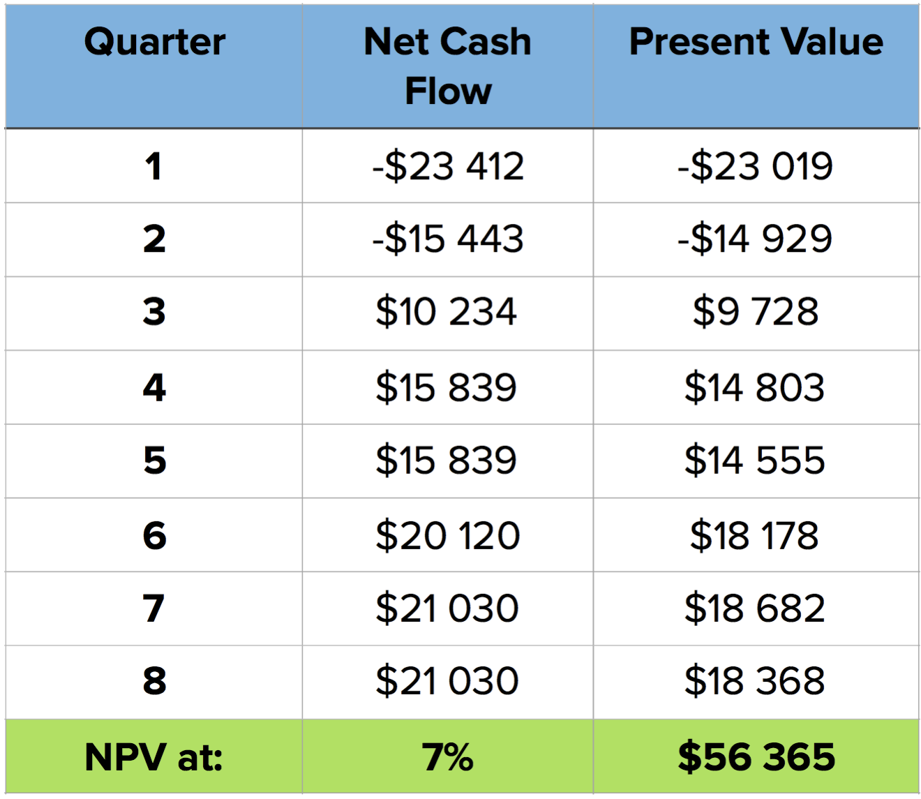
This method allows a company to prioritize between projects by providing an answer to this question: “How much of today’s money will we have after X amount of time, if we invest in project A or project B?”
Internal Rate of Return (IRR)
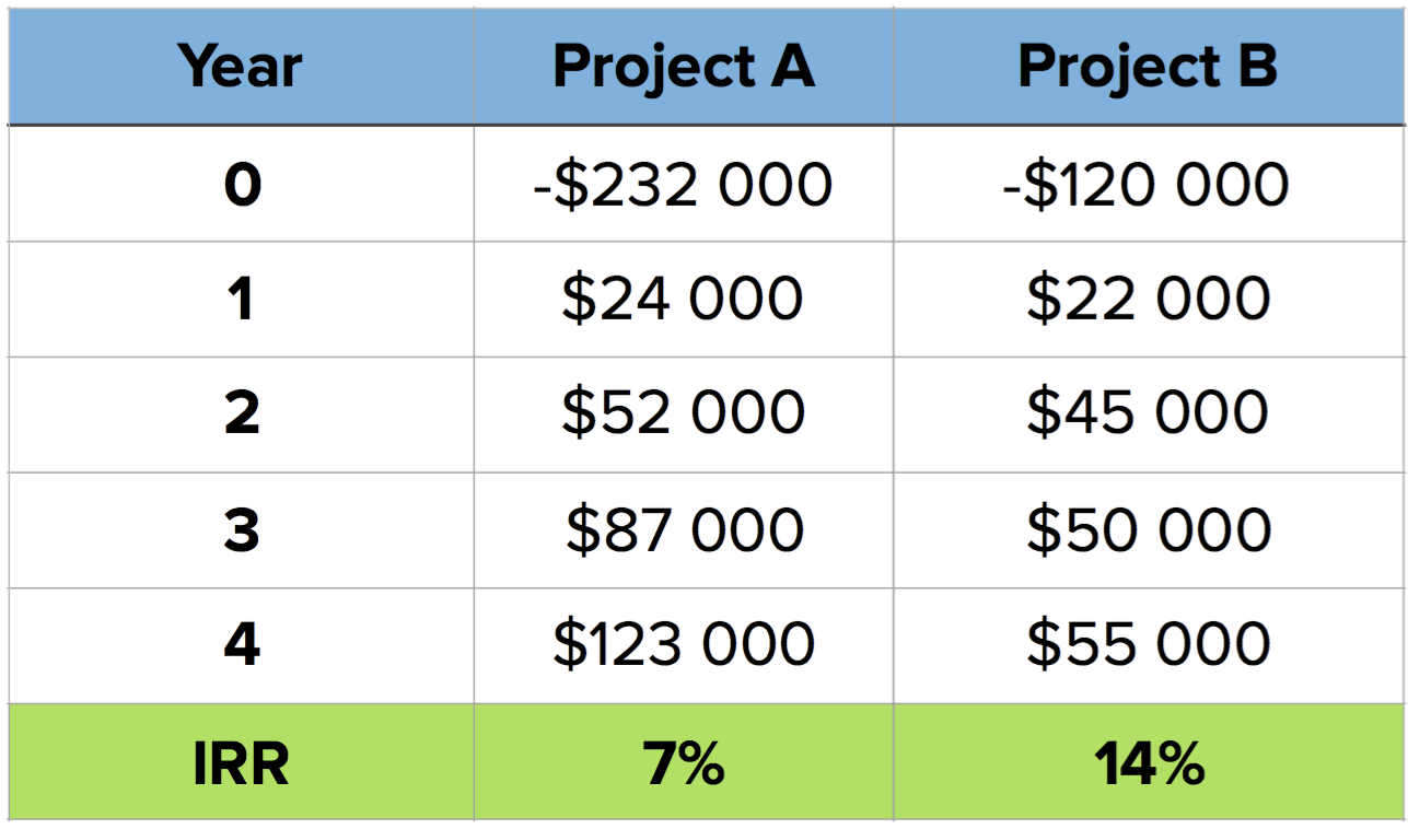
Internal Rate of Return is a measure that expresses the return on a project in percentage terms. In other words, it shows how quickly an investment will increase in value.
IRR is defined as the interest rate at which the NPV is equal to zero. It’s hard to calculate manually, but spreadsheet apps come with this formula, making it trivial to get to — you just need to input the necessary investments and cash flows over time.
From this value, you get a project’s return and can compare it to others. However, this shouldn’t be taken in isolation to make decisions, as the overall NPV or the investment time it takes may be important decision factors.
Discounted Payback Period
The final factor to take into account is how long it will take to get back the investment. For this, we look at the running total of the sum of discounted cash flows. When it turns positive, it means the investment has been recovered.
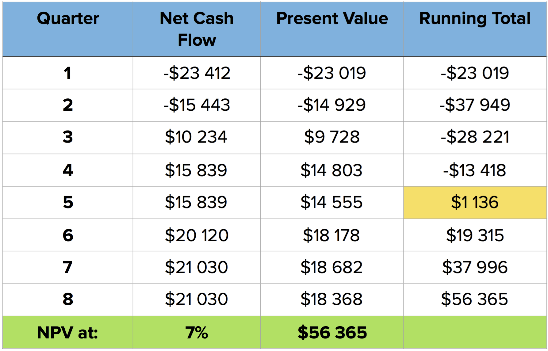
What this number doesn’t tell us is how much money will be made. However, it is useful to measure the level of risk associated with a project. The longer it takes to make the money back, the riskier it is. Depending on the company’s financial conditions and risk tolerance, this can be a critical factor.
Ian McAllister’s Framework
I don’t think this framework has an official name (hence the uncreative one I’m using.) Given its author’s experience and the huge popularity it has on Quora, it’s well worth including in this overview. Here’s how it works:
- Define the important themes for the product or business Create a list of the most important themes (e.g. customer acquisition, engagement, activation, ARPU) and select the top three.
- Prioritize and resource the themes Define the relative priority for each theme and how much resources you want to invest in each (team members, marketing, etc.)
- Generate project ideas Use projects ideas you already have for each theme and come up with new ones. Keep in mind the Pareto principle and focus on the 20% of the project that will get you to 80% of the desired outcome.
- Estimate each project’s potential impact Work out the impact you expect from each project, in very broad terms (think order-of-magnitude-similar.)
- Estimate each project’s costs With your team’s (and relevant stakeholder’s) help, come up with an estimation for each project’s costs.
- Prioritize project within each theme Set priorities considering the projects with the best impact-to-cost ratios.
You should check out Ian’s original answer for more details and to read about the multiple benefits he finds in this framework. Out of those, the one that jumps out to me as the most useful is to resource themes independently. That is: pick the important themes and assign team members and other resources beforehand. This sets you free from constantly struggling to prioritize very different themes that you may be developing in parallel.
Impact on Business Goal
Another way[8] to look at prioritization is to align it with business goals and Lean best practices. One cornerstone of the Lean Startup movement is the concept of Validated Learning. As Eric Ries puts it:
“(…) to treat everything we do as entrepreneurs as an experiment — as a scientific experiment designed to help up figure out if we are actually on the path to a sustainable business.”
Following this line of thinking, Dave McClure introduced the AARRR metrics for startups[9]. They’re centered around 5 stages in the customer lifecycle:
- Acquisition: users come to the site / product;
- Activation: users enjoy 1st visit, signup;
- Retention: users come back multiple times;
- Revenue: users’ activity leads to revenue for the product;
- Referral: users like product enough to recommend to others.
These stages are a funnel through which (potential) customers advance. The goal is to broaden the funnel as much as possible between stages.
When defining features for the product, associate a business objective from one of these stages. There may be features or enhancements expected to improve Activation or Revenue, for example. Prioritization then becomes a matter of answering these questions:
- which business goal are we trying to improve at this moment?
- which features are expected to have the biggest impact on that goal?[10]
Depending on the kind of metric or goal you’re targeting, it’s probably best to focus on testing and optimizing just one at a time. This makes it easier to measure the results of what was done and use that to decide what to do next: move on to another metric or keep improving the same one.
Specially for early-stage products, this kind of framework brings a single-minded, quantitative and business-aligned focus to prioritization, which can be very helpful.
Value vs. Risk
One classic way of prioritizing is to compare the Value of what is to be done to some other measure of tradeoff. Usually that measure is Cost (and we’ll go over that in the next section.)
However, Mike Cohn also talks about considering Risk as a prioritization factor in his book, which I’ve found to be an extremely valuable approach for new products and initiatives.
Features are scored in two dimensions: Value and Risk. There are no prescribed ways to estimate value, and for that you may use one of the other techniques presented here. As to Risk, there are multiple kinds, but we’re usually concerned with:
- Schedule risk (e.g. “this might not be done by the time we need it”)
- Cost risk (e.g. “this might cost more to run than what the business case allows”)
- Functionality risk (e.g. “we might not be able to do this”)
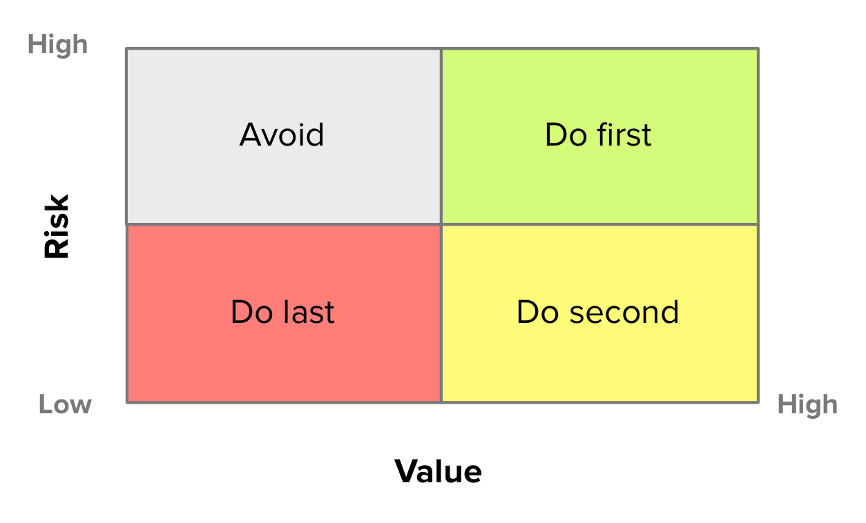
There’s a constant struggle between high-risk and high-value. What should be done first? On one hand, if you avoid risky items and go for high-value first, you might develop a large part of the product before hitting a major roadblock. On the other, if you focus on working on high-risk items first, you might end up doing unnecessary work on features that turned out to be less valuable.
The goal is to look for a balanced approach, going for High-risk/High-value first, Low-risk/High-value second and finally Low-risk/Low-value. High-risk/Low-value items are best avoided.
Value vs. Cost
This is a very common prioritization technique with the advantage of also being very simple. Features are scored on their Value and Cost of implementation. Those with the best ratios will have higher priority. Be mindful that “Cost” doesn’t need to mean actual currency units (i.e. “money”). There are many cost functions that may be much more readily available or easier to calculate. An extremely common such function is the notion of engineering effort or complexity, which is why this method is also often called “Value vs. Effort” or “Value vs. Complexity”.
Also called Bang for the buck, the inherent ROI-like analysis in this method feels intuitive and is also embedded within other prioritization techniques.
The main goal with this method is that we try to maximize value delivery over time. That is, for a given release timeframe, we work on the most valuable items we can fit in the period.
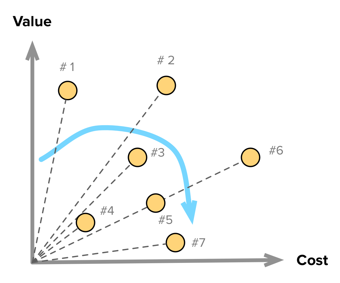
One way to visualize this technique, is through a graph. Scatter plot all features being considered, with regards to their score in each dimension. Then, prioritization rankings will be visible as the slopes of the lines going from the origin to each feature. The higher the slope, the higher the priority.
Another way to visualize this is by using an analog matrix to the Value vs. Risk method:
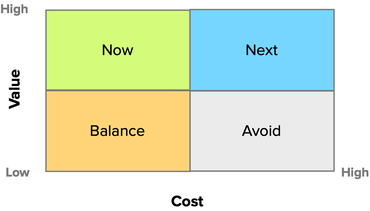
The rationale here is similar to the scatter plot. Start with high-value, low-cost items, and later move on to high-value, high-cost items. Low-value and low-cost items should be balanced throughout the development cycles, as these might represent smaller improvements and nice-to-have items. The reason that this lower-left-quadrant items need to be carefully “balanced” is due to the tendency to prioritize low-cost, low-value items (which have good Value/Cost ratios). As Teresa Torres writes:
If you use time-to-build to prioritize what to build next, you’ll end up with a product full of easy solutions.
As usual, just carefully consider what comes out of prioritization methods and use them as guidelines and not definitive answers.
Scorecard
The Scorecard is another popular technique[11]. The goal is to prioritize features over a set of criteria that have been negotiated with stakeholders. Here’s Daniel Elizalde’s sensible take on the subject:
- Start with a clear strategy that has been validated by users;
- Select the features that are most related to the overall strategy for the next release;
- Define a criteria and weights for scoring;
- Meet with stakeholders and fine-tune the criteria and weights;
- Go over all candidate features/themes and assign a score (e.g. from 1 to 100) on their respective impact for each criterion.

Another way to allow full use of the point scale is to identify a feature/theme that is considered to be in the middle of it for each criterion. Then, score all other features in comparison to that one; a shorter scale (from 1 to 5) will work best in this approach.
The scorecard can be a useful exercise for companies to evaluate what they believe is the relative impact on strategic objectives for a group of possible new features.
There is however very valid criticism for this method:
- Is it scoring the right things? (i.e. are scoring categories really aligned with the product strategy?)
- Are weights and scores “cooked” to prioritize features already favored by opinion and politics, while at the same time give the appearance of objective analysis?
- It can lead to fragmented products, unfocused from their Unique Value Proposition.
Theme Screening
Theme Screening is related to Scorecards, but its focus is on evaluating themes and features in relative terms. The workflow is similar:
- Define the criteria under which to evaluate features and themes;
- For each criterion, choose a “baseline” feature/theme. A good baseline theme is one that is likely (but not guaranteed) to be chosen for the next release;
- For each feature/theme, score it in comparison to the baseline: a “+” if it has a higher impact than the baseline, a “0” if it’s neutral and a “-” if it has lower impact;
- For each feature/theme and scoring criterion, calculate its Net Score and rank features by this value.

Perhaps by having a bit less confirmation bias (in the form of criteria weights and scoring scales), this method can sidestep some of the drawbacks of scorecards. Also, if considering a single category for ranking, this can be the scoring tool for other prioritization methods that focus on features’ impact on a given business metric or the product’s Unique Value Proposition.
Internal & Qualitative Techniques
Classification Ranking
This kind of ranking is one of the most straightforward (and naive) that we can use. It is however useful for very small and internal projects.
The process is simple: each feature is classified into some category, and then a ranking is produced. Categories must be sortable in some way, e.g. 1-2-3-4-5, High-Medium-Low.
It’s related to MoSCoW, but as it’s typically based on personal (“expert”) opinions, I’ve classified it on the Internal side of methods. You can use it with other stakeholders but the ambiguity of categorization will almost certainly lead to trouble. Better keep it to yourself if you use it at all.
Systemico Model
The Systemico model aims to provide a framework to prioritize entirely in terms of Value to the customer and view that process as something that is systemic and holistic (hence the name.)
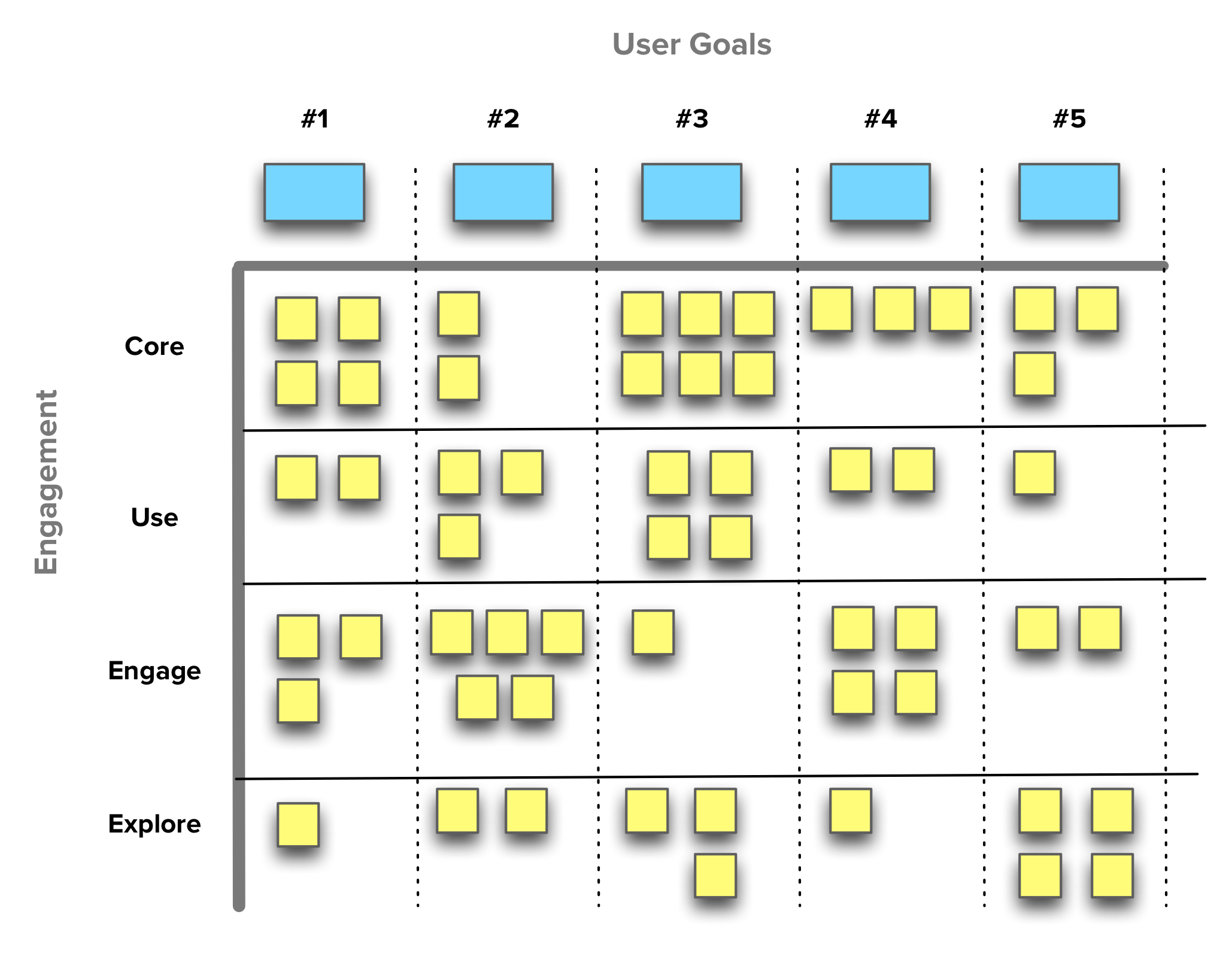
Product requirements are made visible in terms of how they address user goals and engagement levels.
The team behind this model has found it to be of particular usefulness “when working on new products and domains that need to be customer and/or user-centric, especially when there is little or unknown validated learning.”
This model is related to Story Mapping, as it also creates a two-dimensional grid that makes it easy to visualize the scope of the product and the different priority levels.
- User Goals — The first dimension is User Goals. The product is defined not in terms of What it does but in terms Why some functionality is necessary.
- User Engagement — The second dimension uses user engagement as a measure of the interaction level between the user and the product. There are four degrees (in decreasing urgency):
- Core: Features to satisfy users’ basic needs. These are baseline expectations for users in this product space;
- Use: New and improved features to increase the product’s usability. Without these, the product has minimal appeal to the user;
- Engage: Functionality drawing the user to have more interaction with the product and entices her to come back in the future;
- Explore: Features that build a stronger connection between the user and the product as they promote going beyond simple interactions.
User Stories are then placed within the corresponding User Goal and Engagement levels. As User Stories themselves may carry additional value and cost attributes, this model turns into an easy to explore multi-dimensional system.
Just as in Story Mapping, it’s possible to create a release plan that creates increasing value for the customer, and at the same time gather feedback before investing heavily on a given feature set.
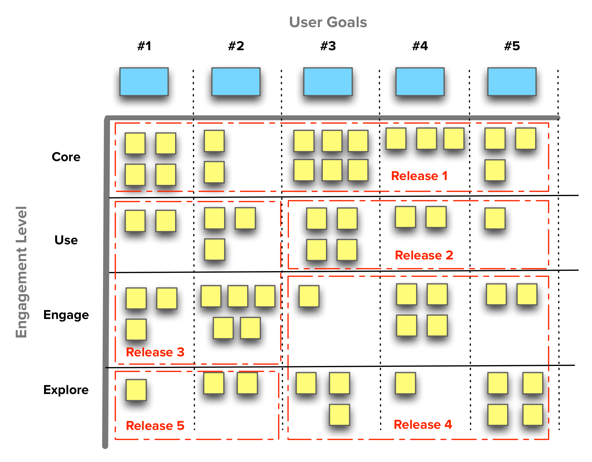
Notice how it progressively delivers Core, Use, Engage and Explore features. It also allows for a breadth-first and depth-first release plan, depending on the focus necessary in some product area
Another Value Mapping approach
The kind of Value Maps that the Systemico Model and Story Mapping create are incredibly useful. They let us visualize different impact levels that features may have on some user goal or activity, leading to easier release planning.
If these approaches show Impact across Product Areas, the Intercom team proposes a prioritization scheme based on Impact on User Base. That is, focusing on what’s used the most by a majority of the product’s user base.
Stacked Ranking
The typical backlog is a flat list of items. This guide covers many techniques on how to organize it differently and how to prioritize it. Most of them will produce a stacked-ranked list of themes or features to develop.
However in many instances (probably the majority), this stacked-ranking is based upon a Product Manager’s own “expert” opinion. In other cases, this list is based on conversations and talks with stakeholders.
This kind of prioritization in not inherently wrong; it’s just not right for user-focused value creation. Due to its widespread usage, it deserves a mention in this guide but its position in the table aims to reflect that this as opinion-based and internally-focused as it gets.
Feature Buckets
The Feature Buckets[12] technique by Adam Nash is also very popular on [Quora](https://www.quora.com/What-are-the-best-ways-to-prioritize-a-list-of-product-features/answer/Adam-Nash “Adam’s answer to “What are the best ways to prioritize a list of product features?” - Quora”).
Adam believes that feature prioritization varies a lot across different product types and industries and that’s why he emphasizes that this technique was thought specifically for consumer internet products.
Feature concepts should be placed in one of four buckets:
- Metrics Movers — Features that will move the target business and product metrics significantly. There should be specific goals and strategies behind the decision to invest in a product or feature (things like AARRR metrics come in handy here);
- Customer Requests — These are features that have been requested directly by customers. They are usually incremental enhancements, but it’s important to consider them or else risk alienating users or miss important feedback coming from their usage of the product;
- Delight — Innovative features that are internally generated based on insights in design or technology. Working on surprising and exciting features is important to delight customers and create a differentiated position in the market (c.f. Kano Model for more on this);
- Strategic — Features that are included for strategic reasons related to learning or future goals (e.g. experimentation and data gathering.)
A well balanced product release should typically include features from all of these buckets. The framework is not explicit as to the appropriate distributions among these buckets and to how to prioritize internally within each. These implementation details are left up to the Product Manager to define.
KJ Method
One final Japanese technique in this overview. The KJ Method is a technique devised by Jiro Kawakita as a group process to establish priorities[13]. It quickly produces “objective group consensus out of a collection of subjective, opinionated data.” It’s on the Internal side of techniques as the way its usage is described is mostly targeted at stakeholders within the same organization.
UIE describes an 8-step process for any group size in under an hour. First, ensure you have the following preconditions:
- Removable sticky notes in two colors;
- Room with lots of wall space;
- One person to be the facilitator (moving the group from one step to the next);
- Whiteboard or flip-chart for the final ranking step.
With all of the above, the facilitator follows this process:
- Determine a Focus Question The focus question drives the results. Every session will have its own focus question (e.g. “Who are our users?”, “What goals do users have when they come to our site?”, etc.)
- Organize the Group People in the group should be from different parts of the organization, to get more diverse perspectives.
- Put Opinions (or Data) onto Sticky Notes Putting one item on each sticky note, each group participant is asked to brainstorm as many items as they can think of.
- Put Sticky Notes on the Wall Each participant puts their sticky notes up on the wall in random order. They also read other people’s contributions. If they think of something else that should go on the wall, at any time, they can just add it to the collection.
- Group Similar Items Once everyone has added their contributions to the wall, the facilitator instructs the group to start grouping similar items in another part of the room.
- Naming Each Group Each participant is asked to assign a name to every group, using the second color of sticky notes.
- Voting for the Most Important Groups Participants are asked to individually use their own viewpoint to choose which groups he or she believes are most important to answering the focus question.
- Ranking the Most Important Groups This is the final and most important step. All individual sticky notes are placed on the whiteboard and ordered by number of votes. Participants can combine similar groups, which adds their votes and moves them up the ranking. When three to four groups have much higher ranking than the rest, the facilitator may stop the exercise.
Because of the combination of free individual opinion through voting and the enforced unanimous consensus in the final step, this method can quickly converge to a group buy-in of priorities. This helps any teams that depend upon stakeholders’ participation and agreement on the product strategy and priorities.
Key Takeaways
After going through all of these techniques you will have probably noticed that they each have contexts in which they make sense to be used and others when they don’t. As much as we’d like to, there are no prioritization silver bullets and we have to choose whatever is more appropriate for our product, team, industry, etc. At the same time, there are important commonalities among these methods that are worth pointing out.
Let’s go over the most important takeaways from this fascinating task we call Prioritizing.
1. Prioritize at a high-level
Essentially all prioritization methods work with high-level features (themes) and user goals. This is important for a couple of reasons:
- The focus is on providing value to the user and not the minutia (at least at first);
- You don’t waste as much time if/when the strategy changes;
- After working out the strategy and high-level priorities, the team should take care of finding the best tactics to get there.
2. Set goals, measure and adjust
Another common characteristic among many techniques is their focus on Effectiveness. They have an underlying notion that our motivation to prioritize is that we’re going after some goal with a measurable effect (impact, ROI, usage, improved business metric, etc.)
The objective is not to set priorities and ship them. The objective is to constantly be aware if what we’re doing is really adding value and working out as expected; when it’s not, we will at least have some clues as to what needs adjustment.
3. Don’t do it alone
Prioritization should not be a solo effort. With the exception of very simple methods, almost all of them involve someone else in the process. Be they customers, stakeholders or team members, it’s very rare that the Product Manager alone will set the overall priorities. We’re just in charge of a process and the product [belongs to the team](https://blog.cauvin.org/2011/12/who-owns-product.html “Who “Owns” the Product? - Roger Cauvin”).
Getting the most external input we can gets us buy-in and confidence that what gets prioritized is effectively valuable. And even then, we’re only sure after measuring the actual results.
4. Quantitative vs. Qualitative
Quantitative does not mean better than qualitative (and vice-versa.). For instance, a common pitfall when using quantitative prioritization methods is that people associate numbers with precision and confidence. Seeing formulas, ratios and rankings usually makes us feel more assured as to the robustness and objectivity of some type of analysis, but these can be gamed. You should keep this in mind both for yourself and when presenting results to other people — these things are guidelines and not infallible outcomes.
Know what you’re getting out of the method and when to use it. These things are tools, not oracles.
5. External vs. Internal
The External and Internal distinction that we’ve used in this guide relates to how much external involvement there is in the prioritization process. The scale goes something like this: You < Team < Stakeholders < Customers.
Again, it all depends on the results you’re trying to get. I’ve personally found it useful to think about it in these terms:
- External techniques are better for prioritizing abstract outcomes;
- Internal techniques are better for prioritizing concrete solutions.
The value of External techniques
In broad terms, external techniques are most useful when you’re trying to navigate through a large set of candidate features, looking to:
- Identify the most valuable ones for your customers — knowing their baseline and performance expectations and also what delights them;
- Getting buy-in and consensus from a group of key stakeholders in larger organizations;
- Gauging which features are not bringing value or actively displeasing customers so you can decide wether to improve or to drop them;
- Getting clients in consulting projects to participate and sign-off on the development strategy and release plan.
Since you’re dealing mostly with “the outside world” is only natural that discussions and prioritization here happen at a more abstract level of user outcomes, goals and high-level features.
The value of Internal techniques
Because you’re involving people that are closer to the product and technology, these techniques are best for prioritizing among more concrete and problems. That is, they’re less exploratory as end users are less involved (if at all.) Thus, they work best whenever you have to:
- Further refine the results obtained from one of the more externally oriented techniques;
- Prioritize a set of features and ideas that you’re confident are aligned with the product strategy and customers’ expectations;
- Work on internal projects without much (or no) contact with the market;
- Quickly prioritize low level features and requirements.
With all of these techniques and takeaways in hand, it’s now up to you. Mix and match them. Make changes. But above all, go out and build great products.
If you’ve made it this far and found this guide helpful, it would be great if you could share it with friends and colleagues that you think might also appreciate it. Also, if you have any comments or questions, just get in touch.
Check out these articles and presentation if you want to learn more about this topic and get different overviews on prioritization methods ↩︎
But do get in touch if you have any change suggestions ↩︎
Noriaki Kano et al., “Attractive Quality and Must-be Quality,” research summary of a presentation given at Nippon QC Gakka: 12th Annual Meeting (1982), January 18, 1984 ↩︎
I’m also a big fan of how Kathy Sierra [frames this idea](/blog/book-review-badass-making-users-awesome/ “Book Review: “Badass: Making Users Awesome” - Folding Burritos”) ↩︎
It seems trivial, but this reality is hard for some non-technical people to accept. ↩︎
“Themes” is a common term in agile methodologies representing a set of major features (epics), which in turn are composed of user stories. Learn more about it here ↩︎
Read this article by Luke Hohmann for a contrarian view to econometric analysis and prioritization ↩︎
Review this presentation by Raviv Turner for The Product Mentor (slide 9) for reference to AARRR metrics prioritization ↩︎
Teresa Torres has a series of articles explaining how to determine the goals to go after and how to distill your features down to a level where you can work on them within your constraints. ↩︎
With its share of detractors ↩︎
Since his original post, Adam has updated the technique to include a fourth bucket for Strategic features ↩︎
The “KJ Method” is also called the “KJ Technique” and “Affinity diagram” ↩︎


